Josh Gallant
Josh is the founder of Backstage SEO, an organic growth firm that helps SaaS companies capture demand. He’s a self-proclaimed spreadsheet nerd by day, volunteer soccer coach on weekends, and wannabe fantasy football expert every fall.
» More blog posts by Josh Gallant
Oli Gardner
Unbounce co-founder Oli Gardner has seen more landing pages than anyone on the planet. He’s obsessed with identifying and reversing bad marketing practices, and his disdain for marketers who send campaign traffic to their homepage is legendary, resulting in landing page rants that can peel paint off an unpainted wall. A prolific international keynote speaker, Oli is on a mission to rid the world of marketing mediocrity by using data-informed copywriting, design, interaction, and psychology to create a more delightful experience for marketers and customers alike. He was recently named the “The 2018 Marketer to Watch,” in the under 46 category, by his mother.
» More blog posts by Oli Gardner
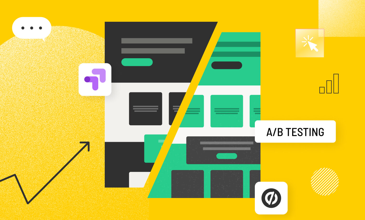
What should you A/B test?
Before we get into the specific elements in your marketing funnels that you should A/B test, let’s take the 10,000-foot view approach first.
The overarching objective of A/B testing is to find ways to get more results from the same (or less) investment.
It’s an optimization game. Once you can improve your click-through rates and conversion rates, you can pour more gasoline on the fire and get better results from more investment. That’s the long game we’re playing here.
So with that in mind—strategically speaking, what should you be A/B testing?
It rolls up to two main things:
1. Positioning and marketing messaging (the what)
Messaging is all about how you present your products or services to the market. You likely have plenty of ideas and hunches about what will resonate, but the best way to answer that question explicitly is to run A/B tests.
Try different angles. Test different value propositions. Experiment with different concepts.
If you can determine what messages and positioning are most likely to pique the interest of potential buyers, you can apply (and benefit from) those findings across the board.
2. Customer touchpoints throughout the user journey (the how)
Alongside the messaging itself is how the messaging is presented.
A typical customer journey will have dozens of touchpoints—some predictable, most fairly random and unique. Throughout this journey, though, there will be critical touchpoints that most buyers pass through. These are the places you want to nail over time. Think core landing pages, checkout pages, thank you pages, etc.
Every lesson you learn from testing how you deliver key messages to potential customers can also be cascaded throughout your marketing engine—even things as simple as color schemes and types of imagery.
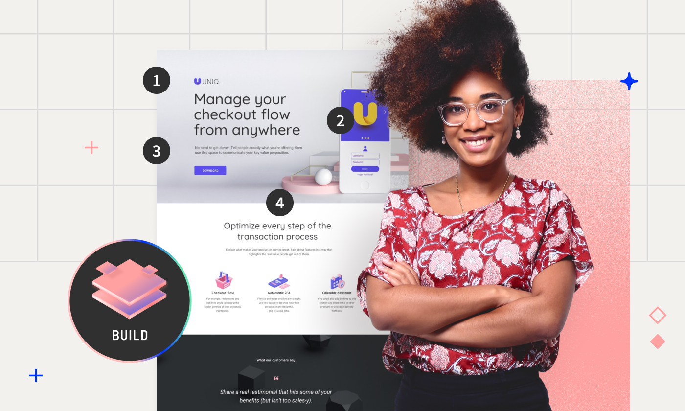
Why landing pages are the best place to run A/B tests
The single best vehicles for A/B testing both messaging and touchpoint design are your landing pages.
With the right tools, A/B testing landing pages lets you control most of the variables that could otherwise clutter up your results. The more variables you have control over, the more conviction you’ll have in the winning variants in your tests.
Think about it like this:
You run an A/B test on a landing page where the only thing you change is the color scheme from light mode to dark mode. After a few thousand visitors to build statistical significance, the dark mode variant outperforms the light mode variant by a wide margin. You now get to walk away with complete conviction that light text on dark backgrounds is the ideal design style for your audience.
What elements can you A/B test on landing pages?
The short and sweet answer is this:
Whatever your heart desires.
As long as you’re using a landing page builder that makes A/B testing easy, that is (and we just so happen to know one). Otherwise, every test becomes a major ordeal that leaves you questioning your sanity.
Anyway, sometimes the wheels (aka your heart’s desires) need a little jumpstart to start spinning. So we’re here to share some inspo and give you a few concrete ideas to run with.
1. Headline testing ideas
Your headline is your first impression. Its success is dictated by how closely it matches what your viewers expected when they decided to visit your page—whether clicking an ad, banner, email link, etc.
You can test positive versus negative language in how you express your value in the headline, for example: “Save Time By Downloading Now” vs. “Stop Wasting Time, Download Now.” You may be able to guess which will work better, but testing lets you know for sure.
A/B test ideas to run with:
- Product-focused vs. outcome-focused positioning
- Short and punchy vs. detailed headlines
- Question-based headlines vs. non-questions
- Numbered lists vs. no lists
- Using specific statistics vs. general statements
- Directly addressing your visitor vs. third-person
- Fear of missing out (FOMO) vs. positive reinforcement
- Dynamic personalization vs. static and more generic headlines
- Seasonal vs. evergreen
- Emotional appeal vs. practical appeal
2. Form testing ideas
Many landing pages include some kind of form to capture data from your visitors. To make them effective, you need to offer something in exchange for the data. Examples would be an ebook, whitepaper, or webinar registration. But what do you test on the form? You’re trying to balance your need for data with the “size of the prize” (what you’re giving away) to find the optimal point of conversion.
A/B test ideas to run with:
- Single-step form vs. multi-step form
- Forms with placeholders vs. forms without placeholders
- Button color tests (e.g., red vs. blue)
- Form field labels above vs. beside the input fields
- Required fields vs. optional fields
- Forms with progress bars vs. forms without progress bars
- Position of the form on the page (left vs. right vs. center)
- Forms with social sign-in options vs. traditional email sign-up
- Long forms vs. short forms
- Forms with CAPTCHAs vs. forms without CAPTCHAs
3. Call to action button (CTA) testing ideas
Your call to action is your conversion. It’s what you want your visitors to do (and nothing else). If people aren’t converting, your call to action may need an update. CTAs should describe exactly what will happen when clicked. A good tip when writing your CTA is to finish the phrase “I want to…”.
- Subscribe to the Newsletter
- Download the ebook
- Get Free Shipping
- Upgrade Now
Strong CTAs should reinforce the thinking introduced in your headline, content, and imagery, effectively ending your page’s story with a solid “what to do next.”
A/B test ideas to run with:
- Button text using “learn more” vs. “discover now”
- Large vs. small button sizes
- Rounded corners vs. sharp corners for button shape
- Button placement above the fold vs. below the fold
- Bright CTA button colors like yellow vs. muted colors like gray
- Uppercase vs. lowercase text on buttons
- Static buttons vs. buttons with animations like hover effects
- Short phrases vs. longer descriptive sentences for calls to action
- Buttons with shadow vs. buttons without shadow
- Gradient background vs. solid color background on buttons
4. Above-the-fold testing ideas
Everything above the fold will represent your true first impression to visitors. Before they’ve even read a single word, they’ll subconsciously scan what’s in front of them. Is it text-heavy or is there breathing room? Is there a video, images, or just words?
Your first goal with your above-the-fold section is simple—avoid the back button. If a visitor isn’t bouncing, your first impression is good enough to keep them intrigued.
A/B test ideas to run with:
- Full-width background image vs. solid color background
- Hero section with a video vs. hero section with an image
- Minimalist design vs. information-rich design
- Slideshow vs. static hero image
- High contrast text vs. low contrast text
- Product video vs. static image as the focal point
- CTA button at the top vs. CTA button after scrolling
- Navigation bar fixed at the top vs. navigation hidden until scroll
- Interactive elements (like hover effects) vs. static elements
- Text-heavy vs. image-heavy layout
5. Color scheme testing ideas
Choosing the right color scheme for your landing page is more than aesthetics; it’s about psychology and strategy.
Different colors can evoke various emotions and actions from your visitors, impacting your conversion rates. For example, using blue might communicate trust and dependability, which is perfect for finance or healthcare sites, while red could create a sense of urgency, increasing click-throughs for sales or special offers.
When you’re planning color scheme tests for landing pages in particular, don’t be afraid to veer from your traditional brand tones. We’re not saying to throw your entire brand guidelines out the window, of course, but landing pages are one of the best places to experiment with ways color can change visitor emotions.
A/B test ideas to run with:
- Monochromatic vs. complementary color schemes
- Bright vs. pastel color palettes
- High contrast vs. low contrast color schemes
- Warm colors vs. cool colors
- Neutral backgrounds vs. bold backgrounds
- Text color with light on dark vs. dark on light
- Color psychology (e.g. using blue for trust vs. red for urgency)
- Gradients vs. solid colors
- Seasonal color themes vs. standard color themes
6. Ecommerce product page testing ideas
Optimizing ecommerce product pages is crucial for reducing cart abandonment rates and increasing sales. With A/B testing, you can uncover which elements—detailed product descriptions, the placement of customer reviews, or even the color of your “Add to Cart” button—resonate best with visitors and shoppers.
Just remember to keep the main thing the main thing. Identify the metric that matters for your product pages and relentlessly optimize toward it.
A/B test ideas to run with:
- Product images with models vs. standalone product images
- Short product descriptions vs. detailed product descriptions
- Price display at the top vs. price display after product details
- Customer reviews featured prominently vs. customer reviews below fold
- Vibrant vs. neutral “Add to Cart” button color
- Product videos vs. product image galleries
- Product features as bullets vs. paragraphs
- Tabbed product information vs. single long page information
- Recommended products at the bottom vs. recommended products on the side
- Product badges (like “Best Seller” or “New”) vs. no badges
- Social share buttons visible vs. social share buttons hidden
7. Social proof testing ideas
Social proof can dramatically influence purchasing decisions on your site. In fact, 92% of consumers feel hesitant to buy when no customer reviews are available.
You can boost credibility and trust by incorporating customer testimonials, star ratings, or real-time purchase notifications. Testing different forms of social proof allows you to see which methods are most effective in engaging your audience and encouraging conversions. For instance, does displaying many positive reviews at the top of a product page increase confidence and decrease hesitations? Does embedding real Amazon reviews or X (formerly known as Twitter) testimonials help boost conversions or just cause clutter on the page?
A/B test ideas to run with:
- Customer testimonials vs. case studies
- Star ratings displayed prominently vs. more subtle star ratings
- Social media follower count highlighted vs. not displayed
- Real-time purchase notifications vs. no notifications
- “Featured in” media logos at the top vs. at the bottom
- User-generated content vs. professionally produced content
- Customer quotes vs. customer video testimonials
- Trust badges near CTA vs. trust badges in the footer
- Endorsements from celebrities or influencers vs. endorsements from regular customers
- Customer success stories integrated vs. linked as separate case studies
8. Messaging and body copy testing ideas
The words you choose and how you present them can significantly impact your site’s effectiveness. A compelling narrative or clear, benefit-driven bullet points might resonate differently with your audience.
When you can make the copy on your landing page feel like it was written solely for one person—your visitor—your likelihood of converting can skyrocket. For example, personalized calls to action can improve conversion rates by over 202% compared to default versions. Test different tones, from conversational to formal, and structures, from detailed storytelling to straightforward facts, to discover the optimal way to communicate with your visitors.
Testing messaging on landing pages can also give you the cheat codes for what you should say on other key pages. The stakes are low on landing pages compared to rolling out brand-new positioning on the homepage.
A/B test ideas to run with:
- Conversational tone vs. formal tone
- Bullet points vs. paragraph format
- First-person (“We offer”) vs. second-person (“You’ll receive”) narrative
- Feature-focused copy vs. benefit-focused copy
- Short, succinct messages vs. long, detailed descriptions
- Copy with technical jargon vs. jargon-free copy
- Urgency-creating language (“Limited offer”) vs. no urgency
- Copy with emotional appeals vs. copy with rational appeals
- Storytelling elements vs. straightforward facts
- CTA within the body copy vs. CTA after the body copy
9. Pricing and offer testing ideas
Pricing strategies can directly influence the perceived value of your products and impact purchasing decisions. Experiment with different pricing formats like straightforward pricing vs. tiered options or monthly vs. annual billing. For example, offering a discount for annual billing might entice longer customer commitment, while a limited-time promotional price could boost immediate sales. Over time, you’ll ideally see trends that maximize revenue long-term.
You can also test how your pricing or offers are presented using strategies like price anchoring where you “anchor” the price with a higher number or reference point, only to then present your offer as a better value afterward to tap into buyer psychology and improve revenue per visitor.
A/B test ideas to run with:
- Single pricing vs. tiered pricing options
- Monthly vs. annual billing (with a discount for annual)
- Discounts for first-time buyers vs. no initial discount
- Money-back guarantee vs. no money-back guarantee
- Free trial vs. no free trial
- Bundle offers vs. single product offers
- Cross-sell recommendations vs. no recommendations
- Price anchoring (showing higher price first) vs. straightforward pricing
- Early bird pricing vs. standard pricing
- Limited-time offers vs. always available offers
10. Landing page layout testing ideas
Testing different layout elements like the placement of customer testimonials, the visibility of pricing options, or the arrangement of features and benefits can help you squeeze more juice out of the same orange. (In this case, the orange is all of the copy and media already on the page).
You don’t always need to change the words or the visuals on the page to run an A/B test. Sometimes, testing how those words and visuals are presented and organized can unlock a few more percentage points on the conversion rate scale.
A/B test ideas to run with:
- Video at the top vs. video further down
- Customer testimonials at the top vs. before the CTA
- Social proof early on vs. near pricing or contact details
- Immediate CTA at the top vs. CTA after detailed content
- Features right after the hero section vs. after an introduction
- Pricing options early vs. at the end of the page
- Lead generation form immediately visible vs. after content
- FAQ section near the top vs. near the bottom
- Comparative analysis early vs. after context is built
- Interactive elements at the beginning vs. later to emphasize points
What can you A/B test beyond your landing pages?
Of course, landing pages aren’t the only place you can run experiments. You can also run A/B tests that target both the pre- and post-conversion phase.
- Pre-conversion tests: Ad creatives, ad placements, etc.
- Post-conversion tests: Email campaigns, nurture sequences, etc.
Email campaign testing ideas
After your landing page has done its job and captured an email—the testing doesn’t have to stop. You can A/B test your email marketing campaigns, including automated follow-ups and nurture sequences, to maximize the value per lead. If you can get more leads to take the next action (i.e. make a purchase, request a demo, etc.) the value of each lead will likely increase.
By A/B testing elements of your email campaigns like subject lines, length, and the sender name you can potentially boost open rates, click-through rates, and overall results.
A/B test ideas to run with:
- Email subject line with a question vs. subject line with a call to action
- Personalized greeting vs. no personalization in the greeting
- Long-form content vs. short and concise messages
- Sending emails in the morning vs. evening
- Inclusion of images vs. text-only emails
- Discount offers vs. informational content
- Single CTA vs. multiple CTAs
- Weekly frequency vs. biweekly frequency
- Emotional appeal vs. practical appeal in the content
- Series of nurture emails vs. standalone promotional emails
Ad creative and targeting A/B testing ideas
Exploring different ad creatives and targeting options can make a big difference in how well your ads work together with your landing pages.
For example, test image-based ads against video ads to see which type draws more visitors to your site and how those visitors interact with your page. You could also compare how ads for a broad audience perform versus those targeted to specific groups. Perhaps a straightforward, bold headline brings in more clicks than a subtle one. Matching the look and message of your ads to your landing pages can help create a smooth experience for users, encouraging them to stick around and take action.
A/B test ideas to run with:
- Image-based ads vs. video ads
- Dynamic retargeting ads vs. general audience ads
- Ads with bold, attention-grabbing headlines vs. subtle headlines
- Use of testimonials in ads vs. product features
- Geographic targeting vs. behavior-based targeting
- Ads optimized for mobile vs. desktop formats
- Seasonal-themed ads vs. evergreen ads
- Direct purchase link calls to action vs. learn more link
- High saturation color schemes vs. minimalist color schemes
- Specific audience segment targeting vs. broad audience targeting
How to prioritize A/B testing ideas
As great as it would be to literally run every single one of these tests (or every idea you come up with), the reality is this:
Your team only has so much bandwidth, budget, and time to work with. Sometimes you need to trim a big list of A/B test ideas down to a more feasible and prioritized list. The good news is that you can actually take a “scientific” approach to the list-trimming process so you don’t just have to guess blindly.
Let’s break down a few common A/B test prioritization frameworks—PIE, ICE, and PXL.
PIE framework
The PIE framework is a simple three-part scoring system to measure the potential gains, relative importance, and overall ease of an A/B test. If a test idea could generate huge returns on an important page, and is relatively easy to implement—it’ll score well.
- P = Potential: How much improvement can be gained from the test?
- I = Importance: How critical is the element or page you’re testing to the business?
- E = Ease: How easy is it to implement this test?
ICE framework
The ICE framework is similar to the PIE framework, just with a focus on confidence rather than the page’s importance. You’re still measuring impact and ease, but now instead of weighting a test based on the page, you’re weighting it based on how confident you are in your impact estimates. If you’re certain that a test will have a huge impact, you should prioritize that test over another where your confidence in the impact is lower.
- I = Impact: How significantly could this test affect the key metrics?
- C = Confidence: How confident are you in the test’s success?
- E = Ease: How straightforward is the test to execute?
PXL framework
The PXL framework was developed by Peep Laja and CXL. It’s a more detailed scoring system that gets you to answer and score 10 questions. From there, you sum up the scores and the highest scoring ideas are where you should start.
Building a culture of marketing experimentation
Hopefully, the ideas in this post help give you some inspo for your next wave of A/B tests, but the most important thing to keep in mind is this:
It’s not what you test that matters—it’s that you’re testing.
The best growth and marketing teams constantly experiment, develop new hypotheses to test, and learn from the data. A/B testing isn’t just a box they check because their favorite marketing podcast called it a good idea—testing has become part of their entire culture.
The key to successful conversion rate optimization isn’t which elements on the page you decide to test—it’s the belief that you should always be testing.