Paul Park
Paul is a writer on Unbounce’s content team who lives and breathes storytelling. (It’s like oxygen but with better plotlines!) Ask him what he’s up to at any given moment and you’ll get answers ranging from folding paper dragons (y’know, origami) to catching up on the latest cool tech, and finding other ways to channel his inner geek.
» More blog posts by Paul Park
10 real-world examples of A/B testing that made an impact
A guy named Isaac Newton (you may have heard of him) once said, “If I have seen further, it is by standing on the shoulders of giants.” To help you see the benefits of A/B testing and how it can get you closer to achieving your goals (and, hopefully, that promotion you’ve been eyeing), here are some A/B testing giants whom you can stand on examples that’ll help spark inspiration.
- Going
- Campaign Monitor
- First Midwest Bank
- Electronic Arts
- Performable
- TechInsurance
- Grene
- Vancouver 2010 Olympic Store
- HubSpot
- Vestiaire Collective
1. Going: How a three-word change led to a triple-digit conversion boost
In the bustling world of online travel deals, convincing potential customers to dive deeper into your offerings can sometimes feel like trying to spot a suitcase on a crowded baggage carousel. Going, a company dedicated to offering unbeatable travel deals, faced the challenge of converting visitors into premium plan subscribers. Despite having compelling offers, their conversion rates just weren’t hitting the desired targets.
So Going turned to Unbounce (hey, that’s us!) and used our A/B testing solution to find a better path forward.
Problem:
Going’s main hurdle was how they presented their subscription plans. The standard approach encouraged visitors to sign up for a free, limited plan, hoping they would upgrade later. This method was not effectively showcasing the full value of Going’s premium offerings, leading to underwhelming conversion rates.
Solution:
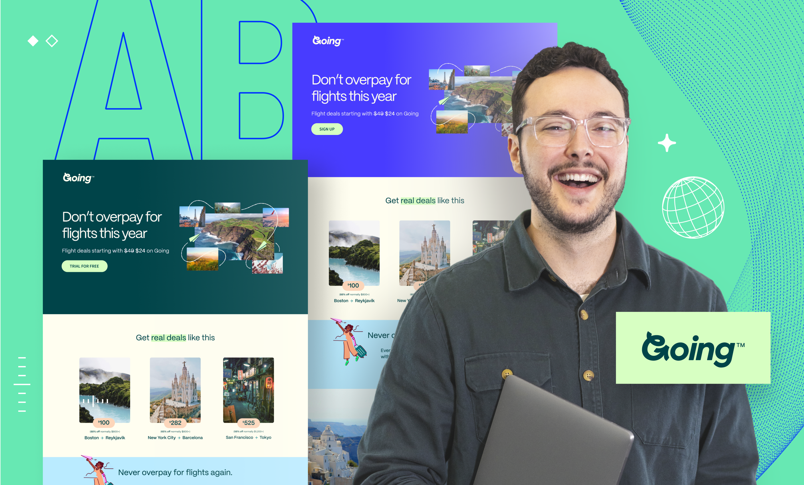
To address this, Going leveraged Unbounce’s A/B testing tools to tweak their call to action (CTA). They tested two variations on their homepage: “Sign up for free” versus “Trial for free”.
This simple, three-word-change aimed to better highlight the benefits of the full-featured premium plan by offering a free trial period, making the value proposition clearer and more immediate to potential customers.
Check out the two variants below:
Variant B, which turned out to be the winner, as you can tell from the trophy and confetti
Results:
The results were nothing short of spectacular. The new “Trial for free” CTA led to a 104% increase in trial starts month-over-month. This significant uplift not only improved conversion rates through paid channels but also surpassed the performance of organic traffic for the first time.
The success of this A/B test provided Going with valuable insights, driving them to further optimize their marketing strategies and use Unbounce’s capabilities to continually refine and improve their customer acquisition efforts.
2. Campaign Monitor: How dynamic text enhancement led to a 31.4% conversion lift
When it comes to digital marketing, aligning every element of your campaign to the user’s intent can make a big difference in boosting conversion rates. This was precisely the challenge and opportunity faced by ConversionLab, a digital agency from Norway, working with their client, Campaign Monitor. Their experiment sheds light on the impact of fine-tuned message matching in PPC (pay-per-click) campaigns, particularly through A/B testing.
Problem:
ConversionLab noticed that despite well-designed PPC campaigns, there was still room to increase the relevance of Campaign Monitor’s landing pages to potential customers.
Their hypothesis centered around a crucial detail: the verb used in the user’s search query. They theorized that aligning this verb on the landing page to the one used in the search would increase the page’s perceived relevance and, by extension, its conversion rates.
Solution:
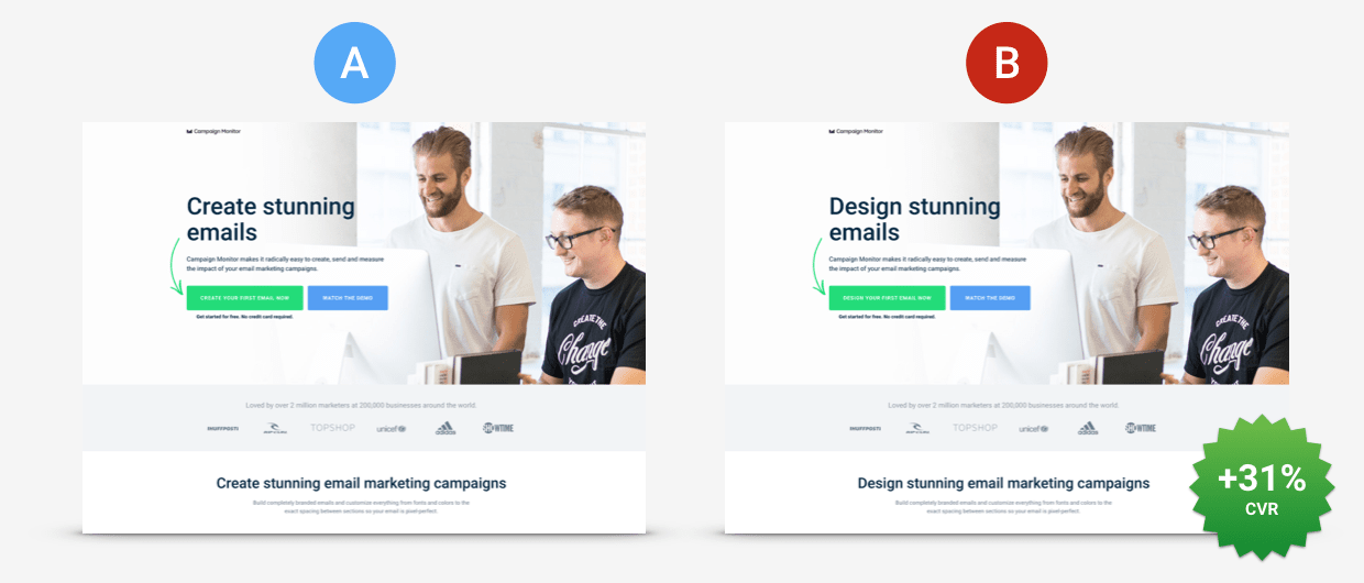
To put their hypothesis to the test, ConversionLab employed Unbounce’s dynamic text replacement (DTR) feature. This enabled them to dynamically change the text on the landing page to mirror the exact verb used in the user’s search query.
For example, if a user searched for “design on-brand emails,” the landing page would automatically adjust its headline and CTAs to include the verb “design” instead of alternatives like “build” or “create.”
Then they used A/B testing to release this hypothesis into the wild and measure the results:
Variant B used DTR to send prospects through to signup and helped lift conversions to trial by 31.4%
Results:
The A/B test ran for 77 days, during which the landing pages accumulated a total of 1,274 visits. The variant employing DTR demonstrated an enormous 31.4% increase in conversions, which in this case meant signing up for a trial of Campaign Monitor’s software (and, hopefully, earning the marketing team some well-deserved high fives).
3. First Midwest Bank: Using A/B testing to explore new approaches
In conservative sectors like banking it’s often expected that organizations stick to traditional methods. First Midwest Bank challenged the status quo by exploring creative ways to build trust with their customers and stand out from their competitors.
This case study explores their innovative approach to A/B testing on their landing pages, which not only defied industry norms but also significantly boosted their conversion rates.
Problem:
The banking industry is often bound by stringent brand guidelines and a conventional aesthetic that leaves little room for creativity. This environment can make it pretty darned hard to test and adopt new methodologies that could potentially increase conversions.
Also, the need to collect more personal information from customers adds another layer of friction, making trust a crucial part of any successful conversion strategy.
Solution:
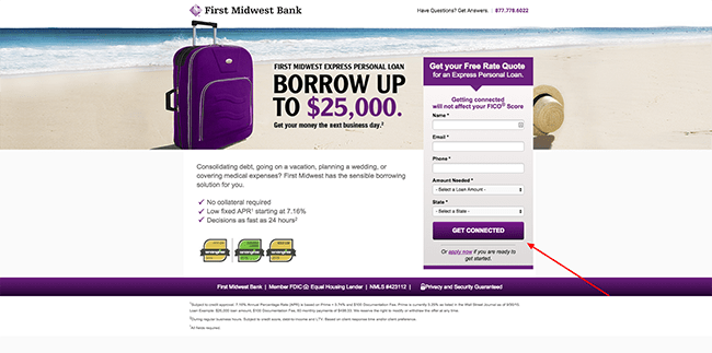
First Midwest Bank took creative liberties with their landing pages to stand out and build trust with potential customers, pushing the boundaries of typical industry practices. They started by using Unbounce’s A/B testing feature to examine a well-known best practice: the use of human photos on landing pages.
Predictably, photographs of people did increase conversions, but the bank didn’t stop there. They delved deeper, customizing the imagery to reflect the demographic nuances of different states. For example, while a landing page featuring a smiling man boosted conversions by 47% in Illinois, it underperformed in Indiana, leading to a 42% decrease.
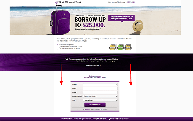
This insight propelled them to A/B test 26 different landing pages tailored to each state’s audience. Additionally, they questioned the “best practice” rule of placing crucial elements above the fold. They challenged this notion and positioned a form below the fold, resulting in a surprising 52% increase in conversions. (So much for the conventional wisdom that users are reluctant to scroll, eh?)
Variant A: Keeping the form above the fold
Variant B: Moving the form below the fold outperformed Variant A by a whopping 52%
Results:
First Midwest Bank’s bold A/B testing strategies led to impressive outcomes, including a 195% increase in overall conversions (wowza!). By tailoring the imagery to local preferences and rethinking the placement of conversion elements like forms, they not only increased engagement but also demonstrated the potential of creative flexibility in a traditionally rigid industry.
4. Electronic Arts and SimCity 5: Using A/B testing to challenge assumptions
When Electronic Arts (EA) rolled out SimCity 5, they weren’t just playing games with their marketing strategy—they were playing to win. Known for their blockbuster releases, EA was all set to make a splash with SimCity 5. But they knew that even in the world of gaming, it’s the little tweaks that can spawn epic wins or losses.
Problem:
In the modern age of gaming, gamers can bypass traditional retail and download games directly, which is a win-win because it cuts down on costs for EA and ups the convenience for players. Yet, EA faced a pivotal challenge: How to maximize these digital downloads right from the game’s release.
The standard move? Toss in a pre-order incentive like a discount on future purchases. But was this really the way to gamers’ hearts, or just an unnecessary extra life that wouldn’t get used?
Solution:
To find out, EA put their hypothesis to the test with a straightforward A/B test on their sales page. The control version promised a classic 20 percent off a future purchase for those who pre-ordered SimCity 5, banking on the charm of a good deal to boost sales. The variant, however, scrapped the discount and presented a clean, straightforward offer to buy the game, no strings attached.
Variant A with the discount offer
Variant B with no discount offer
Results:
The results were more shocking than a plot twist in a JRPG. Ditching the discount didn’t just work—it worked wonders, boosting sales by over 40 percent compared to the control.
It turned out that SimCity enthusiasts weren’t in it for the savings—they just wanted to play the latest SimCity and probably weren’t interested in buying other games. Half of the game’s sales turned digital with this approach, proving that when you understand your players, you don’t just make sales—you make fans.
If you’ve ever found yourself in a heated debate over the best button color for boosting conversions, you’re not alone. The team at marketing automation company Performable faced a similar dilemma, questioning whether the hue of a CTA button could truly influence user actions on our homepage. Spoiler alert: It can, and it did.
Problem:
The digital marketing realm is awash with opinions on the “ideal” button color—green, red, pink, you name it. Each has its champions, claiming it as the secret sauce for conversions. Performable decided to put these color theories to the test, specifically focusing on the two heavy hitters: green and red.
Solution:
They A/B tested two identical versions of their homepage, with one stark difference—the color of the CTA button. One sported a green button, blending seamlessly with their site’s palette and echoing the universal “go” signal. The other featured a bold red button, aiming to grab attention but traditionally signaling “stop”.
Would visitors prefer to “go” or “stop”?
Results:
The outcome was a game-changer. The red button led to a 21% higher click-through rate than the green. This wasn’t just a small win—it was a testament to the power of standout elements in driving user engagement. The red button, despite its conventional use as a stop signal, cut through the noise and captured more clicks, translating into significant gains across all downstream metrics.
This test was a vivid reminder that assumptions in marketing are just that—assumptions. They need to be challenged and tested. The red vs. green button experiment proved that sometimes, going against the grain with something as simple as a color change can yield unexpectedly powerful results.
6. TechInsurance: How landing page testing boosted PPC conversions
Sometimes the path to increasing conversions is not about attracting more traffic, but about optimizing the traffic you already have. TechInsurance faced a common challenge—maximizing the effectiveness of their PPC campaigns.6
Problem:
Originally, all PPC traffic was directed to TechInsurance’s general homepage. This approach was straightforward but lacked the targeted appeal that specific segments of their audience might prefer. The hypothesis was simple, yet powerful: Could a dedicated landing page, tailored to the nuances of their PPC audience, outperform the generic welcome mat of their homepage?
Solution:
TechInsurance decided to put their hypothesis to the test by crafting a dedicated landing page designed specifically for their PPC campaign traffic. This page was fine-tuned to meet the expectations and needs of visitors coming from their ads, focusing on delivering a more relevant and engaging message. Then they A/B tested it against the homepage.
Variant A (homepage) and Variant B (dedicated landing page)
Results:
The results spoke volumes. The dedicated landing page outperformed the website’s homepage by a staggering 73% increase in conversion rate. This huge uplift not only demonstrated the value of specialized content but also highlighted the importance of aligning the landing page experience with the specific intentions and interests of the incoming audience.
Potential customers are more likely to convert when they land on a page that speaks directly to their needs and expectations, creating that instant “this is exactly what I was looking for” feeling. If you’re looking to enhance the performance of your ad campaigns, consider testing a dedicated landing page that resonates deeply with the demographics and desires of your target audience.
7. Grene: How a mini cart makeover doubled purchases
At Grene, a powerhouse in the Polish agriculture ecommerce scene, a mini cart revamp was not just about sprucing things up—it was about seriously boosting those sales numbers. And they nailed it, big time.
Problem:
The mini cart on Grene’s site was like that one drawer everyone has at home—full of interesting stuff but a bit of a mess. Shoppers were getting tripped up by a “Free Delivery” label they mistook for a clickable button, squinting to see item totals, and scrolling way too far to find the “Go To Cart” button. It was clear—the mini cart needed a makeover, stat.
Solution:
Grene slapped a handy CTA right at the top of the mini cart to whisk users off to the main cart page without a hitch. They added a “remove” button next to each item to clear up any “oops” moments with accidental clicks, and they made the total cost of each item impossible to miss. Oh, and that “Go To Cart” button? They made it big, bold, and easy to spot, which reduced the chances of people accidentally scrolling right past it.
Variant B: the updated version
Results:
Post-makeover, not only did more folks click through to the cart page, but Grene also saw their ecommerce conversion rate jump from 1.83% to a snazzy 1.96%. The cherry on top? A whopping 2X increase in the total purchased quantity. That’s right—double the goods flying off the virtual shelves.
Grene’s mini cart transformation is a perfect reminder that sometimes, it’s the little things that count the most. Tweaking just a few elements in the user journey can dramatically ease the shopping process and lead to some pretty impressive gains.
8. Vancouver 2010 Olympic Store: One (checkout) page to rule them all
When it comes to the online shopping experience, the checkout process is often where the race is won or lost. The official store for the Vancouver 2010 Olympics put this crucial phase under the microscope to see if a simpler, streamlined approach could snatch more sales from the jaws of cart abandonment.
Problem:
The question was simple yet pivotal: Should the checkout process sprawl across several pages, or could it be condensed into a single page without causing shopper stress? Conventional wisdom suggests that fewer clicks could mean fewer opportunities for customers to bounce, but would this hold true for Olympic memorabilia?
Solution:
The store tested a bold hypothesis: By compressing the multi-step checkout into one sleek, single-page process, more customers would stick around to complete their orders. Through an A/B test they redirected 50% of their traffic to the new single-page checkout to test this theory against the traditional multi-step method.
Variant A: the original multi-step process
Variant B: the one-page process
Results:
After accumulating over 600 transactions, the results were clear and compelling. The single-page checkout didn’t just nudge the needle—it boosted completion rates by a solid 21.8% compared to its multi-step counterpart. This significant lift in conversions illuminated a strong preference among their customers for simplicity and speed in the checkout process.
This A/B test from the Vancouver 2010 Olympic store serves as a powerful reminder that the “best” checkout process can vary widely depending on your audience and product niche. What works for some might not work for others.
Want to know what makes your customers tick? Put it to the test and let their behavior guide your optimizations.
9. HubSpot: Experimenting with email formats
Here’s an A/B testing email marketing example that shows that even the simplest elements like text alignment can influence user engagement. HubSpot, always on the lookout for ways to enhance user interaction, decided to tackle this head-on with a focused A/B test on their email campaigns.
Problem:
The goal was clear—boost the click-through rates on their weekly subscriber emails. HubSpot suspected that the alignment of the email text might be affecting how users interacted with their CTAs. The hypothesis was that tweaking text alignment could lead to a more user-friendly experience and, hopefully, higher engagement rates.
Solution:
To test this theory, HubSpot set up an A/B test comparing two formats:
- Variant A (control): Emails with centered text, the standard format they had been using.
- Variant B: Emails with left-justified text, a change aimed at enhancing readability and drawing more attention to the CTA.
Variant A: centre-aligned text
Variant B: left-aligned text
Results:
The experiment yielded some unexpected results. Contrary to their hypothesis, the emails with left-aligned text actually performed worse than the centered text, receiving fewer clicks overall. In fact, less than 25% of the left-justified email variants managed to outperform the control group.
This A/B testing email marketing example test from HubSpot serves as a valuable lesson in the nuances of email marketing. While it might seem that aligning text to the left—a format that generally enhances readability in longer texts—would work better, audience preferences can vary widely. This underscores the importance of continually testing even the smallest details and not making assumptions about user preferences.
10. Vestiaire Collective: Trendsetting on TikTok
In the fast-paced world of fashion and social media, staying ahead of the curve isn’t just a goal—it’s a necessity. Vestiaire Collective, a second-hand luxury fashion platform, faced the challenge of capturing the elusive Gen Z demographic on TikTok while promoting their new direct shopping feature. Their approach? A clever blend of influencer creativity and data-driven decision-making.
Problem:
Vestiaire aimed to expand its brand presence on TikTok and engage Gen Z shoppers, a demographic that thrives on authenticity and fresh content. The brand needed to ensure their influencer collaborations were not only creative but also effectively aligned with their business goals of increasing brand awareness and driving app installs.
Solution:
To tackle this, Vestiaire’s influencer marketing agency orchestrated an A/B testing campaign that didn’t cramp the style of their creative partners. They enlisted eight influencers, granting them extensive creative freedom to develop a variety of TikTok posts, each embedded with specific CTAs that aligned with Vestiaire’s objectives. The content varied widely, giving the campaign a diverse range of creative angles.
An example of influencer creative freedom
After the initial content creation, the real magic of A/B testing came into play. The agency analyzed the performance metrics of these posts to identify which ones truly resonated with the audience. The top-performing content was then amplified through targeted paid advertising, optimizing reach and engagement.
Results:
The results were nothing short of fabulous. Vestiaire’s strategic use of A/B testing led to over 4,000 new app installs and halved the cost per install, demonstrating a significant improvement over their performance metrics on Instagram and YouTube.
Vestiaire’s success story is a powerful testament to the impact of integrating A/B testing into influencer marketing strategies. It shows that allowing creative freedom, coupled with a methodical evaluation of content performance, can lead to stellar results in both engagement and cost efficiency.
How to do A/B testing
Now that you’ve seen what a big difference A/B testing can make in helping you achieve your marketing goals, you’re probably rarin’ to go with A/B testing your own landing pages. Here’s how to get started:
Create a hypothesis
By starting with a hypothesis you not only figure out what you want to test, but also how you’ll know if the test is successful or not. Make sure your hypothesis is:
- Focused on a single issue: Pinpoint exactly what you want to solve or understand.
- Testable: You should be able to prove or disprove it by the end of your test.
- Impact-driven: Aim for something that could significantly move the needle, like boosting conversion rates or reducing bounce rates.
Use the trusty “If, then” structure to shape your hypothesis. For instance, “If we use a more vibrant CTA button, then our click-through rate will increase.”
Set your variables: control and treatment
Identify what you’re testing:
- Control variable: This is your current champion, the original version of your landing page. (This can be the “A” in your A/B test.)
- Treatment variable: Introduce the challenger (“B”), a tweaked version of the page based on your hypothesis.
Decide what to test
The beauty of A/B testing is its versatility. You can test almost anything that might affect user behavior. Some common elements include:
- The copy of headlines or body text
- Call to action (CTA) button design or wording
- Images or video content
- Overall layout and navigation of the page
Check out our A/B testing ebook for a handy list of 20 elements you can test on your landing page.
Measure for statistical significance
Ensure your results aren’t just a fluke. Understanding the statistical significance of your findings is crucial. This fancy term just means making sure the changes in performance between your control and treatment are likely due to your modifications, not random chance.
Choose your goals
What’s your endgame? Increased site traffic, lower bounce rates, higher engagement? Your goals should align with your hypothesis and be clearly measurable. This focus will not only guide your experiment but also help you understand the outcomes.
Split your audience correctly
It’s generally best to divide your traffic between the control and treatment versions of your page equally and randomly. This way, each version gets a fighting chance to prove its worth under similar conditions.
Yes, there are situations where you might not want to divide the traffic evenly, like if you’re testing something that’s risky that you only want to expose to a small amount of traffic. But overall, an even split is your best bet.
Analyze and act
Once your test runs its course, dive into the data. Did your treatment outperform the control? Or was it a no-go? The data will tell you not just who won, but by how much. Based on these insights, decide whether to adopt the new version, run more tests, or head back to the drawing board.
Keep in mind that even a “failed” test can provide valuable insights, if only to show you what you shouldn’t be doing. As Thomas Edison said, “I have not failed. I’ve just found 10,000 ways that won’t work.” (It’s up to you if you want to do 10,000 A/B tests, though…)
A step-by-step guide to A/B testing with Unbounce
The Unbounce landing page builder is not only one of the best tools for creating landing pages, it also includes built-in A/B testing functionality. For a fully detailed guide on how to use the A/B testing tool you can have a gander at this “How to run an A/B test” page, or just keep reading for a quick rundown:
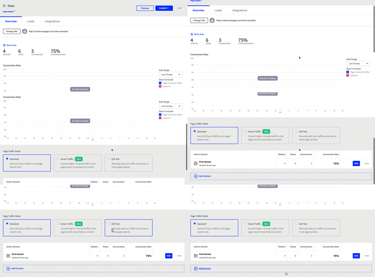
1. After you’ve signed into the Unbounce builder, select the page you’d like to test.
2. Make your way down to the Page Overview screen and look for the section called Page Traffic Mode.




![[Experiment – TOFU] A/B Testing Pillar – V1 – Mar 2024](https://unbounce.com/photos/2.5_VisualCTA_AB.jpg)
