Your product is great, your customer service is honed and you want to attract new customers to your company.
A free trial could be a great option to increase your leads, expose your business to the right market and sell more product.
I mean, who wouldn’t want to try your product or service if it’s free?
It should be a pretty easy sell… maybe.
You have to keep in mind that your potential customer has to commit time, effort and possibly even company resources to giving your product a try.
This costs money. So, to your customer, your “free” trial isn’t actually so free.
But if you keep this in mind and respect your visitors’ time, you can create landing pages that onboard hundreds of new leads per month.
Let’s check out some free trial landing page examples to give you some ideas on how to boost your own conversions and increase your bottom line.
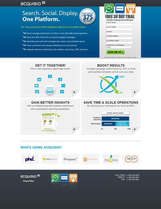
1. Acquisio
This headline needs work
One of the key ways to improve landing page performance is to make sure that every element on your page is crystal clear.
The trouble with Acquisio‘s headline is that it’s open to interpretation. It doesn’t clearly state a benefit of the product. It’s basically just five words that could be easily taken out of context.
A much better approach would be to first clarify that “Search,” “Social” and “Display” are in reference to advertising, and then clarify the “One platform” point. Something like this:
Manage your search, social and display advertising campaigns in one place.
Keep selling me on the product
Look, this product is $375 per month. You’re going to have to do a little more selling than just the headline before you jump into telling me to “try” the product.
The subheadline is there so that I will read the bullet points, which will sell me on the merits of your product or service.
Make me WANT to try your service. In other words, a subheadline like this:
Acquisio is an easy to use campaign dashboard that lets you…
Then lead into your bullets…
Speaking of bullets, where’s the data?
Where are these percentages coming from? Thin air?
Don’t insult the intelligence of your visitors. They’re smart people, and they won’t believe your nice clean stats without some data to back it up.
I’m not saying you have to include a report on your landing page, but at least tell me how you got to the conclusion that your service can improve my campaigns by 30% – after all, I think my campaigns are pretty damn optimized already.
Or how about your claim that you could save me 90% of my time? If you really could save that much time, why isn’t your service used by everyone?
One way of proving these types of stats is to find a testimonial that demonstrates them. Which leads me to…
Give me some social proof
Yes, I realize that you have some corporate logos at the bottom of the page, but let’s face it, most people aren’t going to know all of them.
This page would be much more powerful with a strong testimonial.
Remember, just because you are giving away a free trial doesn’t mean it doesn’t cost your prospect anything.
What about all the time that it will take me to sign up, figure out your software and load my ad campaign data into your service? That comes at a heavy cost to any business owner or manager and using a strong testimonial will help to justify this effort.
2. Dropbox
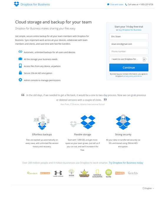
This page is pretty solid. It’s clear, the typography is gorgeous and the use of whitespace is top notch. Let’s look at the ways Dropbox is rocking their landing page.
Not too many fields
Notice how Dropbox only asks for the bare essentials on this free trial page? They realize that there is plenty of time to ask for additional information later (like company name and location). This page stays clean and to the point.
Easy to read bullets and great iconography
Icons can help people understand a point, and Dropbox makes great use of to the bullets points and excellent visual representation.
A testimonial that actually MEANS something
The trouble with most testimonials is that they are boring. “Such and such company is great, they really saved the day blah blah blah.”
Dropbox doesn’t use such a testimonial. They use a quote that actually talks about a pain point that relates to their service: backup recovery.
What do you think is more powerful? A statement about a benefit, or a testimonial that demonstrates it?
But… and there’s always a but
There are always things to test on a landing page. Even though Dropbox has done some great things on this page, there are elements that they could test for improvement. Here’s a quick look:
- Make the form stand out – Test out a new box around the sign up form that draws more attention.
- Add some color contrast – Similar to the last point, try a different CTA color, as right now it strongly matches the rest of the page.
- Copy changes – This headline and call to action combination is very straight forward, but even small copy changes can make a big difference. Always test like a mad man (or woman). Maybe a call to action that says, “Create your dropbox” instead of “Continue”?
3. eVoice
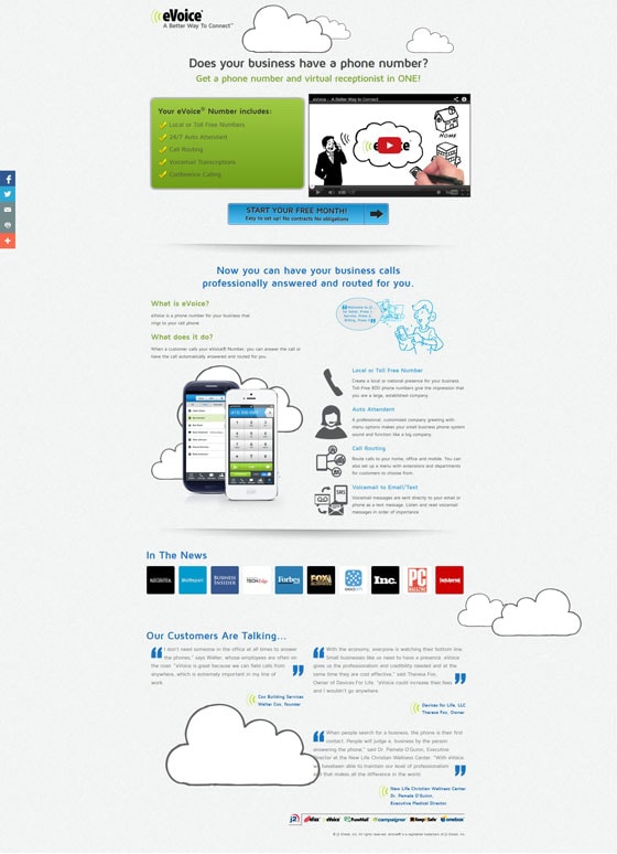
This headline is rubbish
Pop quiz: what is the one thing that you want your headline to accomplish?
You want your headline to get someone to read the subheadline.
That’s it.
eVoice‘s boring question/headline isn’t going to get it done, my friend.
Instead, let’s think like a visitor. I’m a small business owner and I want to have a professional appearance. I already know that I need a toll-free number – that’s why I’m searching for providers.
But I think that it’s going to cost me a lot and that it’s going to be a hassle. Plus, I’m not sure that I want to handle all of those calls that are going to come in.
Now let’s write a headline that targets that visitor:
Never miss an important call again
Get a toll-free number and a virtual assistant at one low price
Ok, now you’ve got my attention.
Where are the benefits?
There is some really great selling copy below the fold, but everything above the fold seems like an afterthought.
First of all, there is no reason for me to watch this video. The screenshot for the video is just some drawing and isn’t really all that enticing. Plus, none of the copy even mentions the video, so why should I watch it?
Second, the green box that stands out only has a list of features in it. As a small business owner I might not have considered voicemail transcriptions before. Why not tell me why I should care? How about this:
- Choose your very own custom local or toll-free number
- Never miss a call with a 24/7 virtual call assistant
- Out of town? Reroute your calls at any time
- Can’t access your voicemail? We’ll email you a transcript
- Free conference calling included
The testimonials are buried
There are some decent testimonials on this page so why not show them off? I would test putting one testimonial directly under the first call to action.
4. GoToMeeting
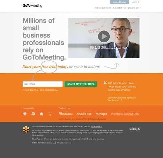
I genuinely like this page and I’m sure that it performs pretty well. I especially like the use of visual cues to point out the important parts of the page. However there are a few things that I think would be worthy of a test.
The web form is awkward
I find that the placement of the web form is strange. Strong horizontal lines – such as the difference between the light grey background and the bright orange section – can cause a visitor to stop reading down the page and completely miss the form.
I would test having the form on the same light background of the headline/video to ensure that visitors know that they are connected.
There is no explanation of what the product does
Unless you watch this video, there is no indication on the page of what GoToMeeting actually does. Granted, lots of business owners would know the brand, but you can never take for granted that your visitors will understand your business model.
A simple statement right above the form might clarify this step. Something like this:
Get access to powerful webinar and virtual meeting software – free for 30 days.
5. Nimble
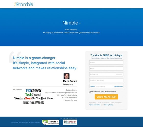
If you didn’t know, Nimble makes CRM (client relationship management) software. Unfortunately, this landing page fails in a few different ways, so let’s take a closer look.
First, the obvious: the dynamic headlines aren’t working
This is a technical issue instead of technique, but it’s no less damaging. The broken code actually turns this page into just a form and a quote – not ideal for conversions.
If there was a headline, I would hope it would be something like this:
Build Profitable Relationships
Nimble simplifies contact management so that you can get to work.
Form fields are confusing
Name and email are just fine, but what’s with the “mycompany” field? There is no explanation of why I am filling in this field, or what will happen when I do.
Are my customers going to see this field? Do I choose something easy to remember?
I would cut this field out entirely and ask for this information on a later step where there is more time to explain.
I’d like to see some features
As with all free trials, there is a time investment involved with signing up. I’m not entirely convinced that there is enough information on this page to actually sell Nimble’s service to a busy professional.
Nimble should at least be putting the key features and benefits of their CRM on this page so that professionals who are familiar with CRM software will know whether it’s worth their time.
6. Qualaroo
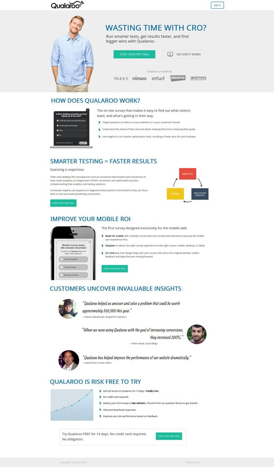
First off, CRO is never a waste of time as long as you’re learning something about your traffic and how they act. Qualaroo is a company that lets you launch mini surveys on your website, allowing you to ask questions to your traffic in real time.
It’s a cool service and personally I love using it, but…
Who is this guy?
Sorry dude, you really have no relevance to the page. Maybe through split testing, Qualaroo has determined that this photo converts better than other, equally non-relevant photos (or they surveyed their visitors and they asked for more stock photos of blonde men), but chances are good that there is a much better photo out there.
Photos that add something to the page are the ones that work best. In this case, a photo of a customer with a quote and a name would be much more powerful. Or even a photo of a person who looked like he was wasting time with CRO? (What does that even look like?)
I like these calls to action
Take a look at the spacing of the calls to action. You can’t go an entire scroll through this landing page without having one on your screen.
I think this is a great technique, but it can also backfire. If you put a call to action too soon on the page you might cause a visitor to move forward in the sequence before they’re entirely sold on the offer.
The key here is to always test your landing page configuration.
I’m also digging the testimonials
Look at these quotes! Aside from the third one, which doesn’t really say much, the testimonials are proving something: that the product works.
Consumers are smart. You can’t just tell them that something kicks ass and expect them to believe it. But if you include testimonials like these then you’re not only adding social proof, but you’re showing real, solid results.
7. SiSense
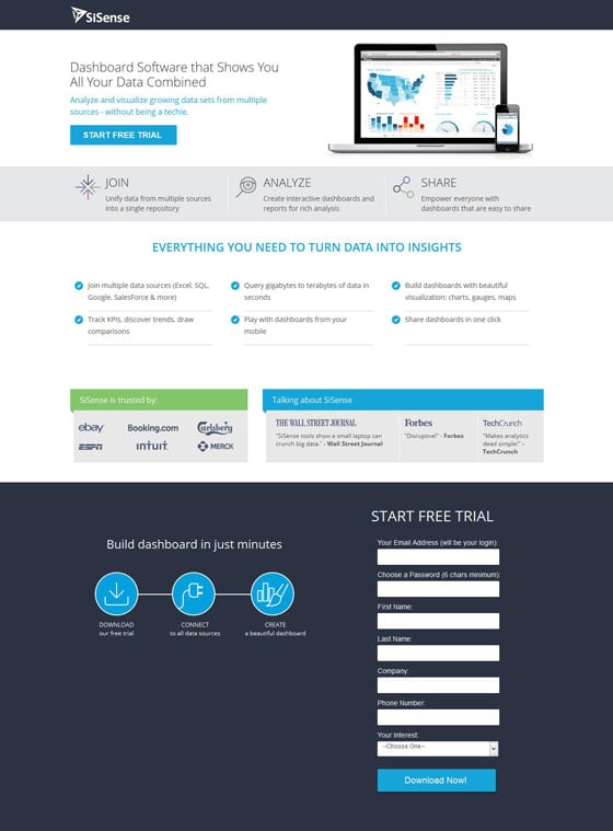
The biggest issue with SiSense‘s free trial landing page is the copy. It’s not that it’s bad, it’s just that it is bland and boring. It needs some focus and some more powerful construction.
Here’s how:
The top three features need more power
“Join,” “Analyze” and “Share” don’t mean a whole hell of a lot on their own, and if they’re going to be one of the highest things on the page, they need more impact.
Three potential headings that would have more purpose:
Combine & Organize Your Data
Get Actionable Insights
Empower Your Team
Is this real software or play software?
One of the benefit statements halfway down the page is that you can, “Play with dashboards from your mobile.”
Is that really something that prospects are going to be dying to do? “Play” with their data?
Heck no. Professionals want to make their lives easier with actionable insights into their data. Focus on telling the story behind that.
Dull statements
Look, your landing page shouldn’t be a lifeless page of statements. Each sentence should draw in the visitor and help to tell the story.
For example:
“Start free trial” should become something like, “Start your free trial now.”
“Build dashboard in just minutes” should become something like, “Build your first dashboard in just minutes.”
Why is the form so buried?
The way this page is laid out, the form at the bottom looks like it’s part of the footer. Redesigning the page to bring more emphasis to the form should remove some of the friction.
8. Google Play
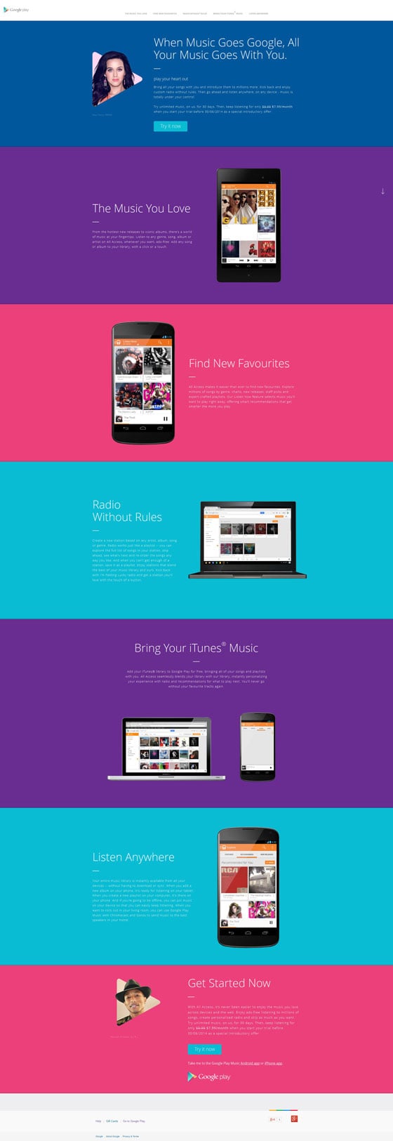
This page from Google Play is a good example of what I was talking about with Qualaroo. Google hasn’t included a call to action with every benefit statement. Either configuration can work, but you need to test it out to find out what will work for your audience.
My concerns for this page stem mainly from the readability. Here’s why:
Bright colors can backfire
Bright colors grab attention for sure, but they can also backfire. When a color (like the blue) has text over it, it can cause readability issues. This is because the contrast between the text and the background is reduced so it makes it harder to read.
This is amplified by…
Small text size is hard to read
The text on this landing page could easily be larger, which would make things easier to read. Not only does a larger text size increase visibility of each word, but it shortens the lines on the page so that visitors can scan copy faster.
Also, the paragraphs could be shorter to improve readability. Having long paragraphs creates blocks of text that are both difficult and unappealing to read.
Where do we go from here?
It’s time to take these ideas and start implementing them into your own tests.
With a few tweaks you should be able to get more from your free trial landing pages, onboard more leads and make more sales.
Have any other examples of elements to test on a free trial landing page? Let me know in the comments.
And until next time, test like hell.
